PowerPoint’s the first bit of software most of us are expected to use that demands visual communication skills. And yet, barely anyone shows you how to do it properly. For some, it becomes a teleprompter. For others, a document packed with bullet points. At its worst? It’s a digital mess of logos, colours, random fonts and clipart. But at its best? It can genuinely help every student in the room.
I’ve spent years working in design and illustration, and I absolutely love teaching visual communication. It’s what gets me excited to plan lessons and talk to colleagues. That moment when a messy idea becomes crystal clear because of one great image or layout choice? That’s the magic.
But let me ask you this: when have you ever been shown how to use PowerPoint from a visual communication perspective? Not how to animate a bullet point or change the background colour – I mean really shown how to communicate meaning clearly through visuals? Most of us haven’t. And that’s a big gap.
This isn’t about making your slides look nice. It’s about using design that helps students understand, remember and stay engaged. It’s about busting some outdated myths, focusing on what really matters, and sharing a few ideas you can use straight away.
Let’s Start by Busting Some Myths

I’ve heard all sorts over the years when it comes to “inclusive” slide design. A lot of it’s well-meaning, but some of it’s completely untrue now (if it ever was). Here are the ones that come up again and again:
- “Comic Sans is best for dyslexia.” There’s no real evidence for this. Fonts like Arial or Verdana are just as good, without looking like a child’s party invitation
- “Always avoid white backgrounds.” Some students find pale colours helpful. Others don’t. There’s no magic shade that works for everyone.
- Use a specific font size for inclusion.” It’s not about size. It’s about structure, spacing and the ability to adapt.
- “Everyone should use the same template.” Templates aren’t the answer. A consistent mess is still a mess.
And to be honest a lot of this advice hasn’t changed in 20 years. I’m still seeing it peddled out in classrooms, offices and meetings and it’s time we moved on!
Inclusive PowerPoint Design Starts With Respect
In design, everything starts with the audience. Always. Every decision, from font to layout to images, should be about the person you’re designing for. We should be doing the same in teaching. Your PowerPoint isn’t for you. It’s for them. Your students. And they’re all different.
Inclusive design means recognising that no single layout or colour scheme is going to suit every person. So the best thing you can do? Make your slides adaptable. Let students adjust them to suit their own needs. That means sharing files in editable formats, showing them how to use accessibility tools, and not forcing one-size-fits-all resources on them.
What Bad Slide Design Actually Looks Like
Even teachers who care deeply about inclusion sometimes create slides that make learning harder. I’ve done it. We all have. It’s easy to fall into the trap of thinking more means better. More colours, more boxes, more pictures. But often, that effort to make things “engaging” ends up making them harder to follow.
Here’s what I see again and again, and what I’ve been guilty of too:
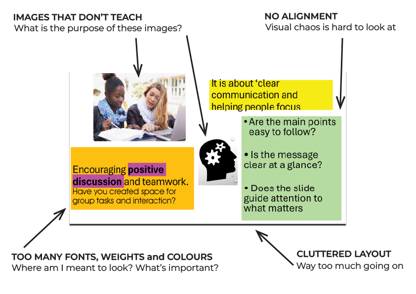
Too many fonts, weights and colours. One slide uses Arial, the next Calibri. Some words are red, others bold, others in all caps. The message gets lost because everything is competing for attention. Our eyes don’t know where to settle. For students who struggle with focus or processing, this is exhausting.
Solution: Choose one font throughout your slides. Use one size for body text and one size for headings. Limit colours to one main colour plus black and white. Use bold only to highlight key points.
Layouts that keep changing. If your heading is in the top left on one slide, then centred on the next, and floating inside an image on the one after, it’s visually jarring. Images shift position. Text boxes move with no clear structure. Nothing feels anchored. Each new slide feels like entering a different room in the dark. It takes energy to get your bearings.
Solution: Keep headings, text and images in the same place on every slide. Use a simple, repeatable layout so students know where to look every time. This keeps their focus on the content, not adjusting to new layouts.
Unnecessary clutter. Logos, decorative lines, background patterns, clipart. These elements don’t help with understanding. They add noise. Even if they’re part of a school template, if they aren’t helping students grasp the key message, they’re getting in the way.
Solution: Remove anything that does not help explain your point. Logos, clipart, and decorative lines should only be used if they add value. More white space helps the important content stand out.
Images that don’t teach. A photo of a handshake. A cartoon of someone holding a sign. A stock image dropped in to “brighten up” the slide. These don’t deepen understanding. They distract from it. If an image isn’t clarifying your message, it’s clutter.
Solution: Only use images that explain something useful. A quick check is to ask yourself, “Does this image help make the point clearer?” If it does not, leave it out.
Lack of alignment. When text and images aren’t lined up, the eye doesn’t know where to look. There’s no rhythm. It feels messy, even when the content is solid. That slight sense of visual chaos can wear students down, especially across a long lesson or series of slides.
Solution: Use the alignment tool in PowerPoint to make sure text and images line up properly. Clean, consistent alignment makes slides easier to follow and reduces visual strain.
Visual Fatigue: The Barrier You Might Be Missing
But, you know, most students won’t tell you your slides are hard to follow. They might squint. They might tune out. They might copy the wrong thing or give up trying to keep up. But they won’t often say, “This slide is making it harder for me to learn.”
I’ve seen it happen. I’ve watched students blink rapidly at overly animated slides, lean forward trying to read overlapping text, or look away completely when there’s too much going on. That’s not about laziness. That’s about fatigue. Visual fatigue is real. And it matters.
The sad part is we often don’t notice it until someone points it out. Or until a student finally says, “Can I just have the notes instead?” Not because they don’t want to engage, but because the slides are making it harder than it needs to be.
This is why layout, spacing and structure matter. It’s not about perfection. It’s about clarity. Clean, well-aligned slides don’t make your lesson prettier. They make it more usable. More human. More respectful of the people in the room who are trying to stay with you.
What You Can Do (Even If You Only Have 15 Minutes)
You don’t need to be a designer. You don’t need special software. You don’t need hours of planning time. If you’ve only got fifteen minutes and you want to make your slides more inclusive and more effective, here’s where to start.
- Strip out the fluff. Take a good look at your slides. What’s actually helping students learn, and what’s just sitting there filling space? Logos on every slide, fancy borders, patterns in the background, or decorative images that don’t explain anything, they can all go. Clear beats clever every time.
- Stick to one idea per slide. Students can only take in so much at once. Give each idea its own space. It doesn’t matter if that means having more slides. That’s not a problem if they’re simple and well structured.
- Line things up. Use the alignment tools. Line your text with your images. Make sure everything feels anchored and intentional. When a slide is clean and ordered, it helps the brain focus on the message, not on figuring out where to look.
- Keep your fonts simple. Use one font for your main text. Stick to one size for body content and one for headings. Avoid mixing bold, italic, underline and colour unless it actually adds meaning. Don’t rely on colour alone to signal importance. Consistency helps with clarity.
- Use the Notes section. If you’ve got lots to say, don’t write it all on the slide. Put the key point on the screen and add the rest to the Notes section. That way, you can speak freely while keeping the slide easy to read. And if you’re sharing the slides later, students can still access your full explanation.
These changes are quick, and they make a big difference. The goal isn’t to build a perfect deck. It’s to stop your slides getting in the way of learning.
The Most Inclusive Thing You Can Do With Your Slides (And It Takes 2 Minutes)
Let students personalise.
Don’t guess what works for everyone. Share editable files. Show them how to change background colour, increase font size or use built-in accessibility tools.
PowerPoint accessibility in teaching isn’t about being fancy. It’s about saying, “You’re welcome to learn in the way that works for you.”
How to Make PowerPoint Images More Inclusive with Alt Text
One of the quickest ways to make your PowerPoint slides more inclusive is by adding alt text (alternative text) to images. This supports students using screen readers by providing a clear description of your visuals.
How to Write Good Alt Text:
Focus on what the image is showing and why it is on the slide.
Avoid phrases like “image of” or “picture of,” because screen readers already announce it is an image.
Keep it short but meaningful, describing the purpose of the image, not just the contents.
Example for This Image:

If you use this image of two people shaking hands in your presentation, here’s the difference between weak and useful alt text.
Bad Alt Text:
“Two people shaking hands.”
This tells the student very little about the point of the image.
Better Alt Text:
“Two business professionals smiling and shaking hands, representing a positive professional relationship.”
This helps the student understand the message or purpose behind the image.
How to Add Alt Text in PowerPoint:
Right-click the image.
Choose ‘Edit Alt Text’.
Type your description based on the point of the image.
If the image is only decorative, you can tick the ‘Mark as decorative’ box so screen readers skip it.
Simple Rule:
If an image helps explain a point, add meaningful alt text. If it is just for decoration, mark it as decorative so it doesn’t waste students’ time.
Make Your PowerPoints More Inclusive with These Simple Built-In Tools
If you want your presentations to work for every student in the room, not just some, there are easy ways to make that happen. You don’t need fancy software or expensive add-ons. You just need to know what’s already at your fingertips in Microsoft 365 and Windows 11.
In PowerPoint (Microsoft 365):
Design Ideas
AI-powered suggestions that create clear, clutter-free slides in seconds. This helps you avoid overcrowded layouts.Alt Text (Alternative Text)
Automatically generates descriptions for images. Always review and edit these so students using screen readers get meaningful information about your visuals.Accessibility Checker
Think of this like your spellcheck for inclusion. It flags missing slide titles, poor contrast, and other barriers. You can find it in the Review tab.Presentation Translator
Provides live subtitles during your presentation with the option to translate into multiple languages. This is useful for deaf or hard-of-hearing students and ESOL learners.
In Windows 11:
Magnifier
Instantly zoom into sections of your screen. Activate with Windows + Plus (+) or through Quick Settings (Windows + U).Colour Filters
Apply filters to support colour blindness or visual stress. Go to Settings > Accessibility > Colour Filters.Sticky Keys
Helpful for mobility difficulties. Use keyboard shortcuts without holding multiple keys. Turn on by pressing Shift five times.Mono Audio and Visual Alerts
Send stereo sound through one channel or get visual notifications that flash your screen instead of relying on sound cues.Narrator
Windows’ built-in screen reader reads aloud text, buttons, and documents. Launch with Windows + Ctrl + Enter.
Why This Matters
Over 1 billion people worldwide have a disability, and many are invisible. By making small, easy changes, you make sure every student can access your presentations fully. This includes students who are using a screen reader, struggling with colour contrast, or need subtitles to follow along.
Quick Tip
Before your next session, run the Accessibility Checker and turn on live subtitles. It takes less than five minutes and makes a real difference.
How to Help Every Student Adapt Your Slides Without Extra Work
Here’s a quick guide to making your slides truly adaptable:
- Immersive Reader: In PowerPoint or Word, go to the View tab and click Immersive Reader.
- Windows Accessibility: Press Windows key + U to access settings.
- Zooming: Ctrl + scroll zooms in.
- Share the file: Don’t lock everything in a PDF. Let students adapt content
These steps help support inclusive PowerPoint design without adding workload.
3 Simple Slide Design Rules That Actually Help Students Learn
- Don’t decorate, communicate. White space isn’t empty. It’s breathing room. A clean slide with one strong message does more than one cluttered with clipart and borders.
- Design for them, not for you. Your students are the end users. Don’t overload the screen just to remember your next point.
- Use alignment and flow. Follow layout principles used by magazines and newspapers. Keep text and images aligned. A structured grid creates clarity.
PowerPoint design for inclusion starts with listening. Students rarely say, “This slide is hard to follow.” But their confusion shows up in the way they engage – or don’t.
Advertising, publishing and education research all tell us the same thing: clear visuals matter. If slides can help sell a product or summarise a newspaper, they can definitely help a student understand ratios or safeguarding.